
Discover our colors
DEEP AUTUMN
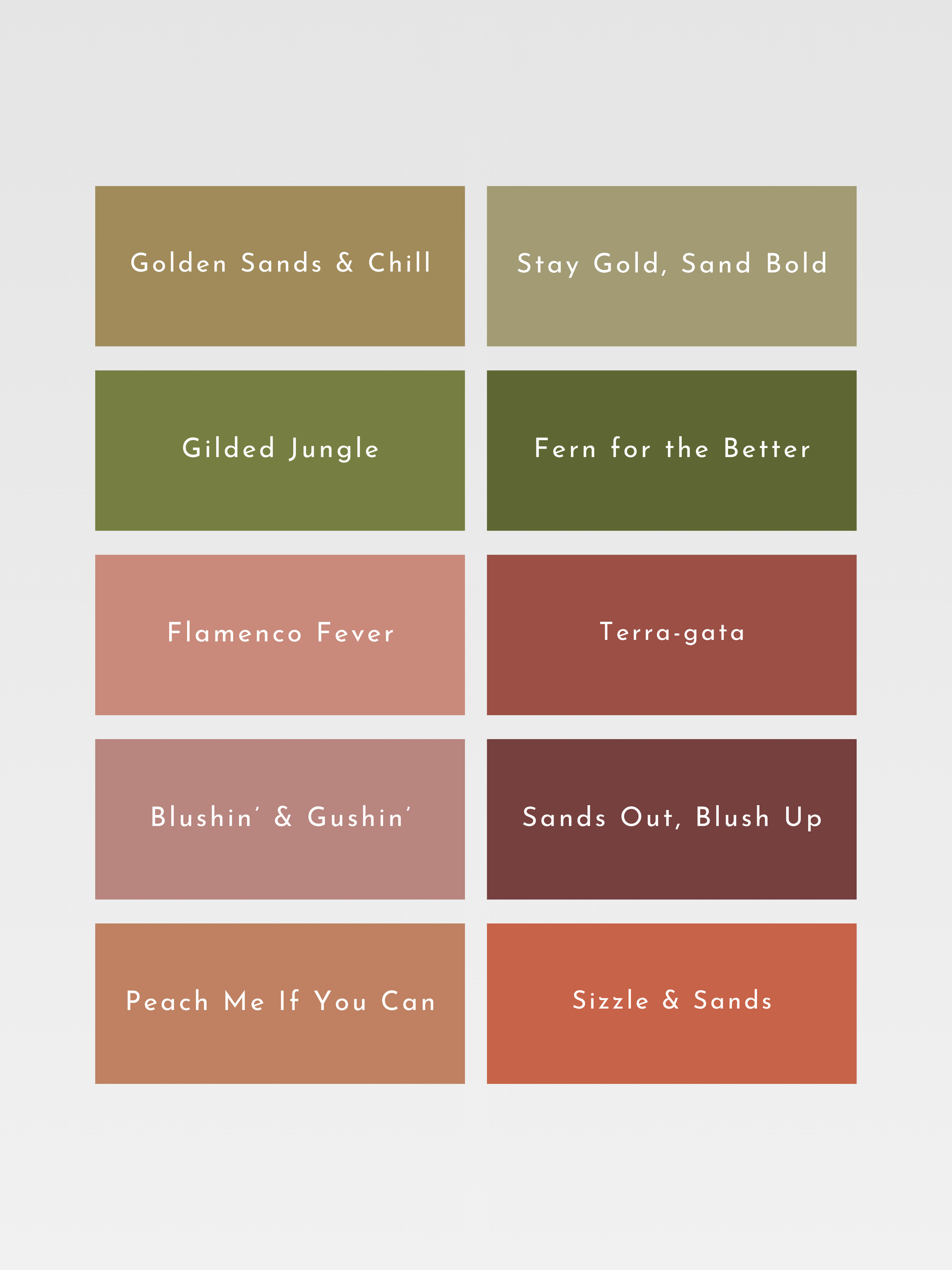
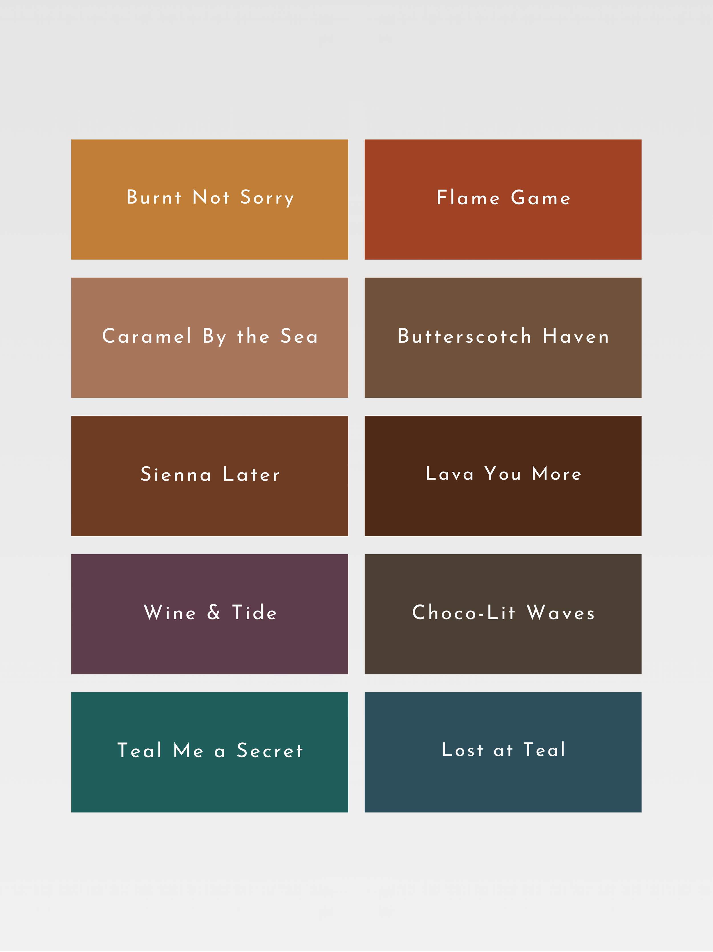
Deep Autumn is a palette of dark, enveloping warmth: espresso brown, forest green, aubergine, deep teal and burnished copper. Its colors combine the earthy warmth of autumn with greater depth and intensity, creating a palette that feels grounded and substantial.
Deep, warm and richly earthy.
WARM AUTUMN
Warm Autumn is a palette defined by glowing, unmistakable warmth: rust, ochre, moss green, burnt orange and warm caramel. Its colors feel full-bodied and sun-warmed, echoing autumn leaves, spices and the richness of the earth.
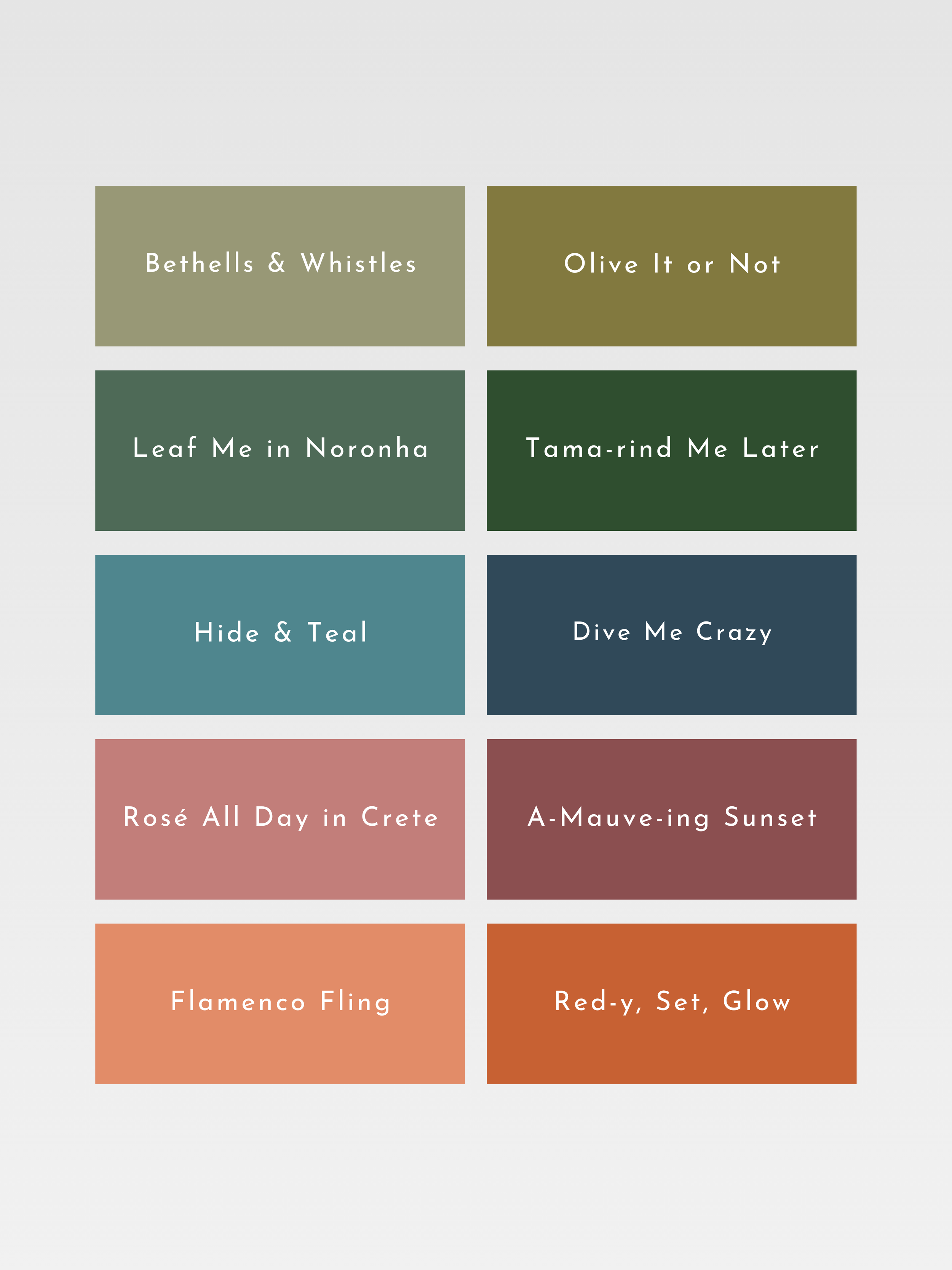
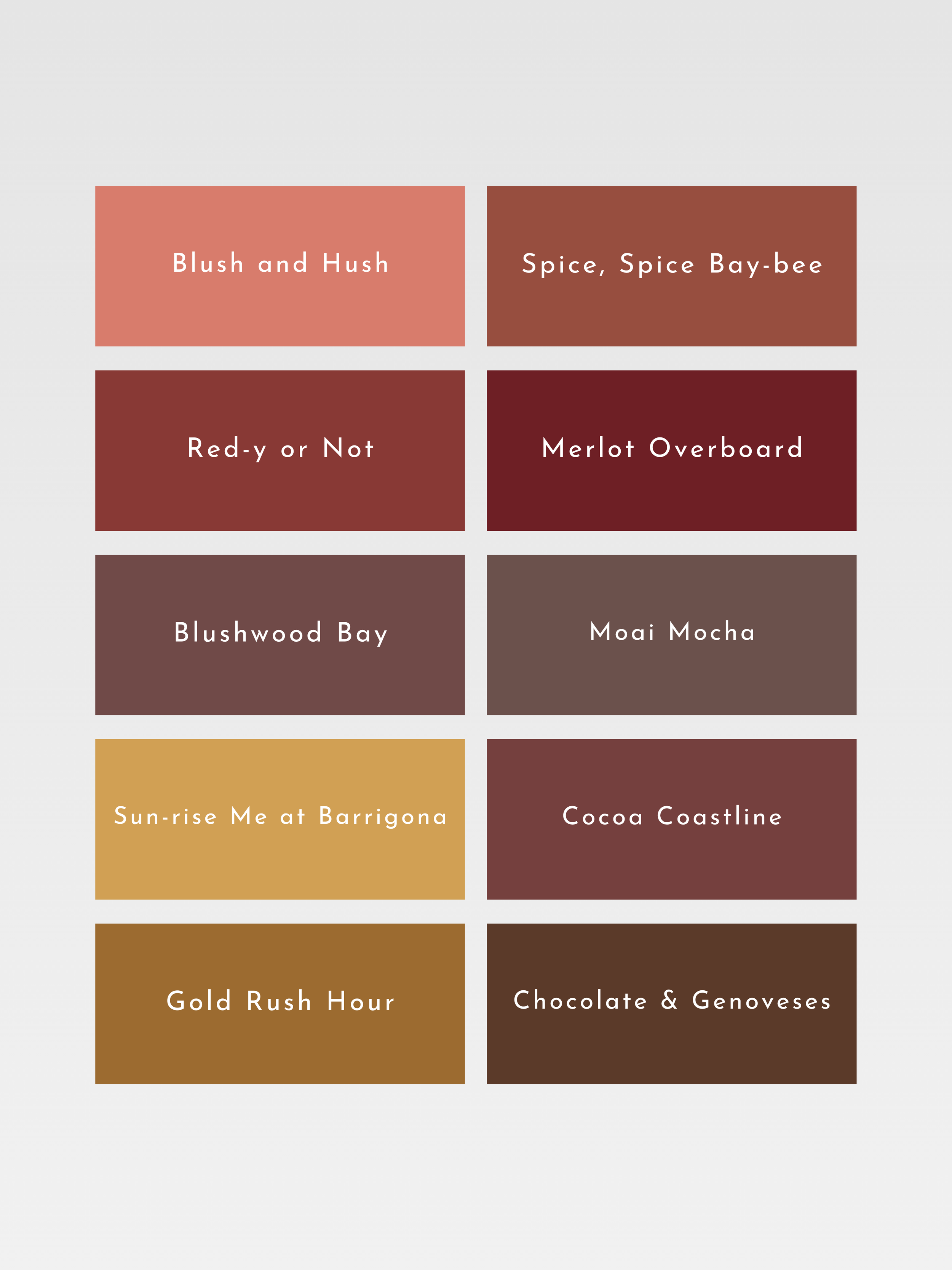
Warm, rich and golden.
SOFT AUTUMN
Soft Autumn is a palette of quiet, blended warmth: muted olive, dusty terracotta, warm taupe, soft teal and faded rose. Its colors are gentle and low in contrast, as though softened by golden autumn light.
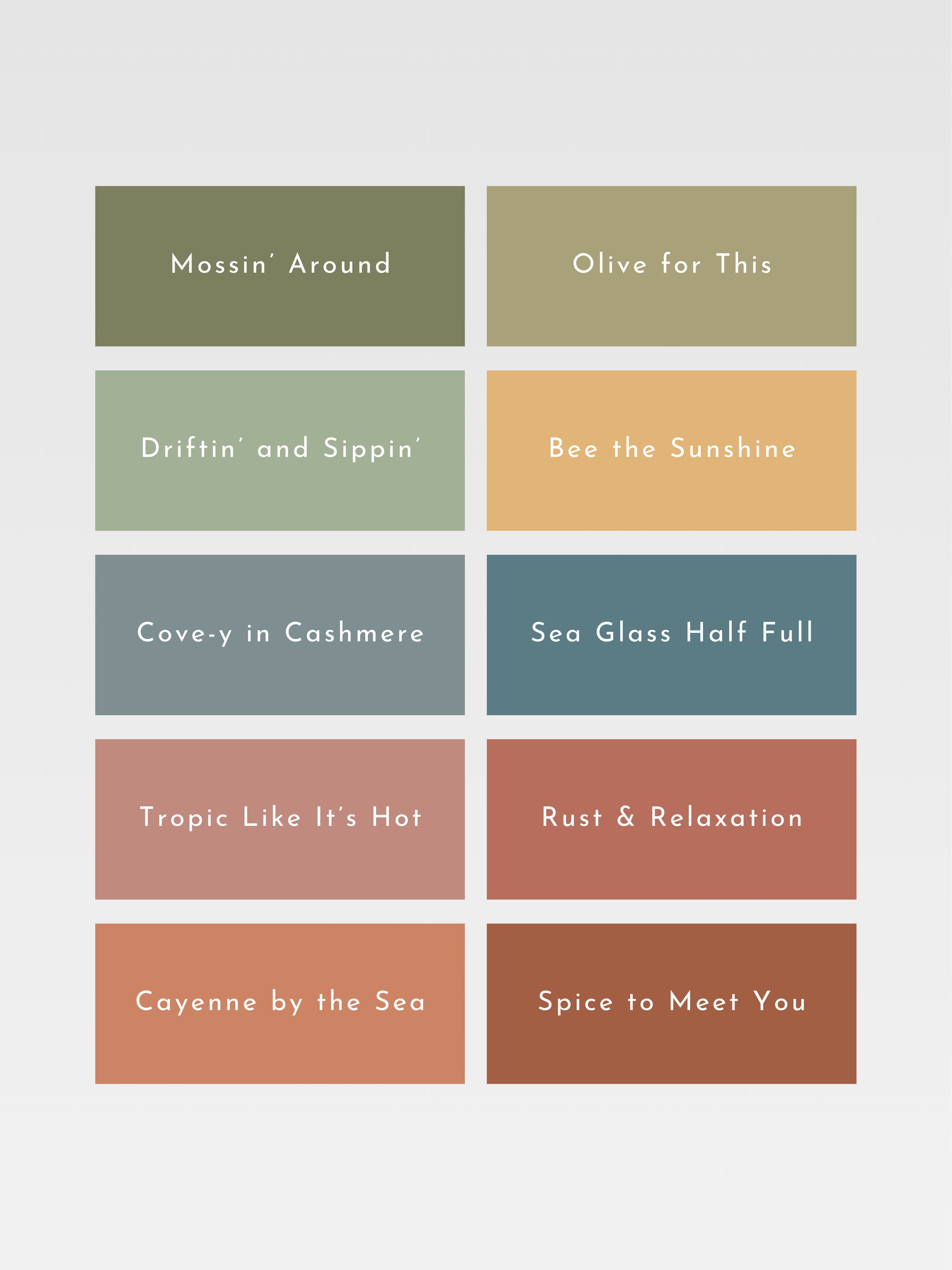
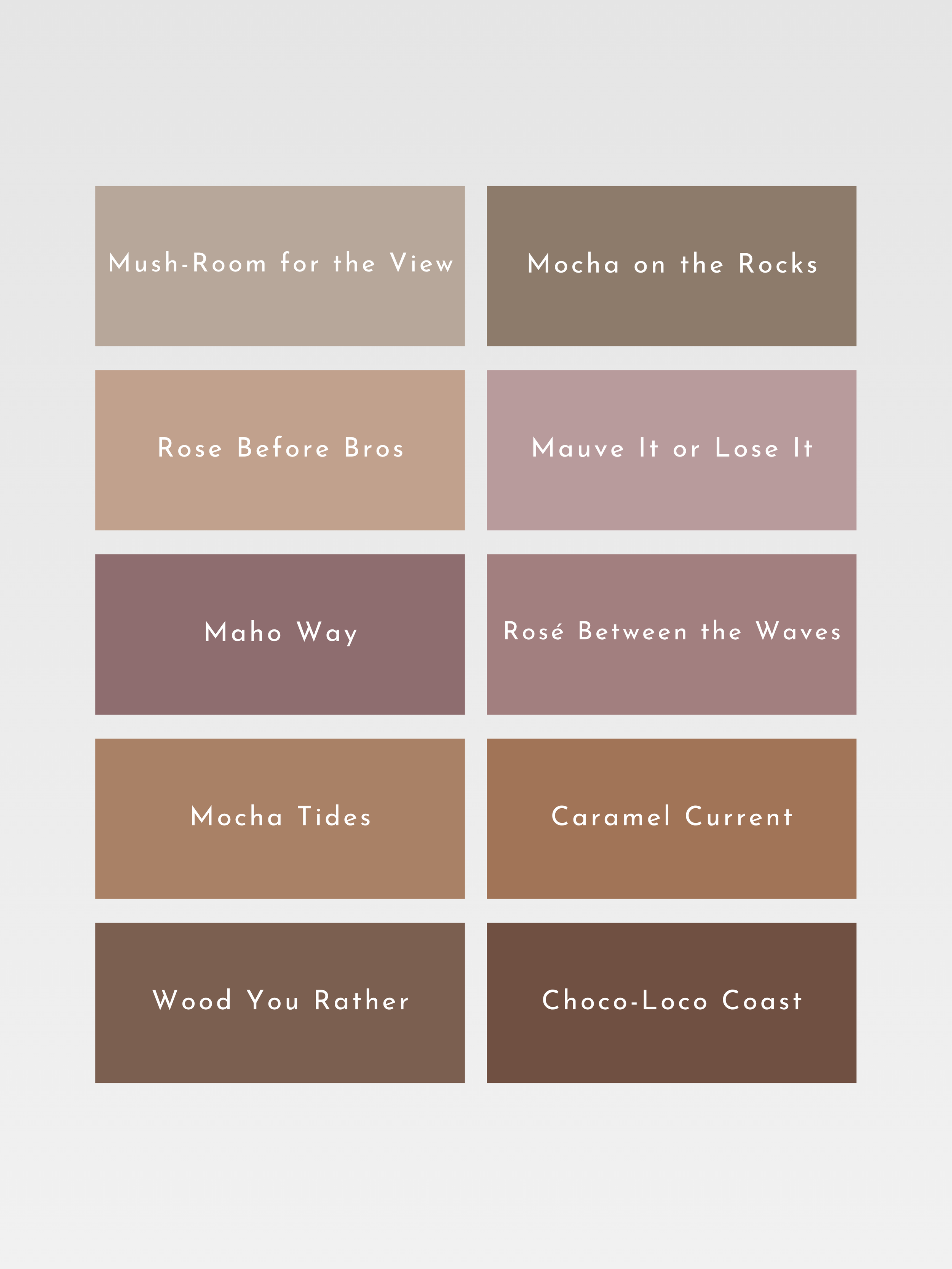
Muted, warm-neutral and earthy.
SOFT SUMMER
Soft Summer is a palette of beautifully softened color: dusty rose, smoky blue, muted berry, eucalyptus and mauve. Low in contrast and gently blended, its shades have a misted quality where no single color feels sharp or overpowering.
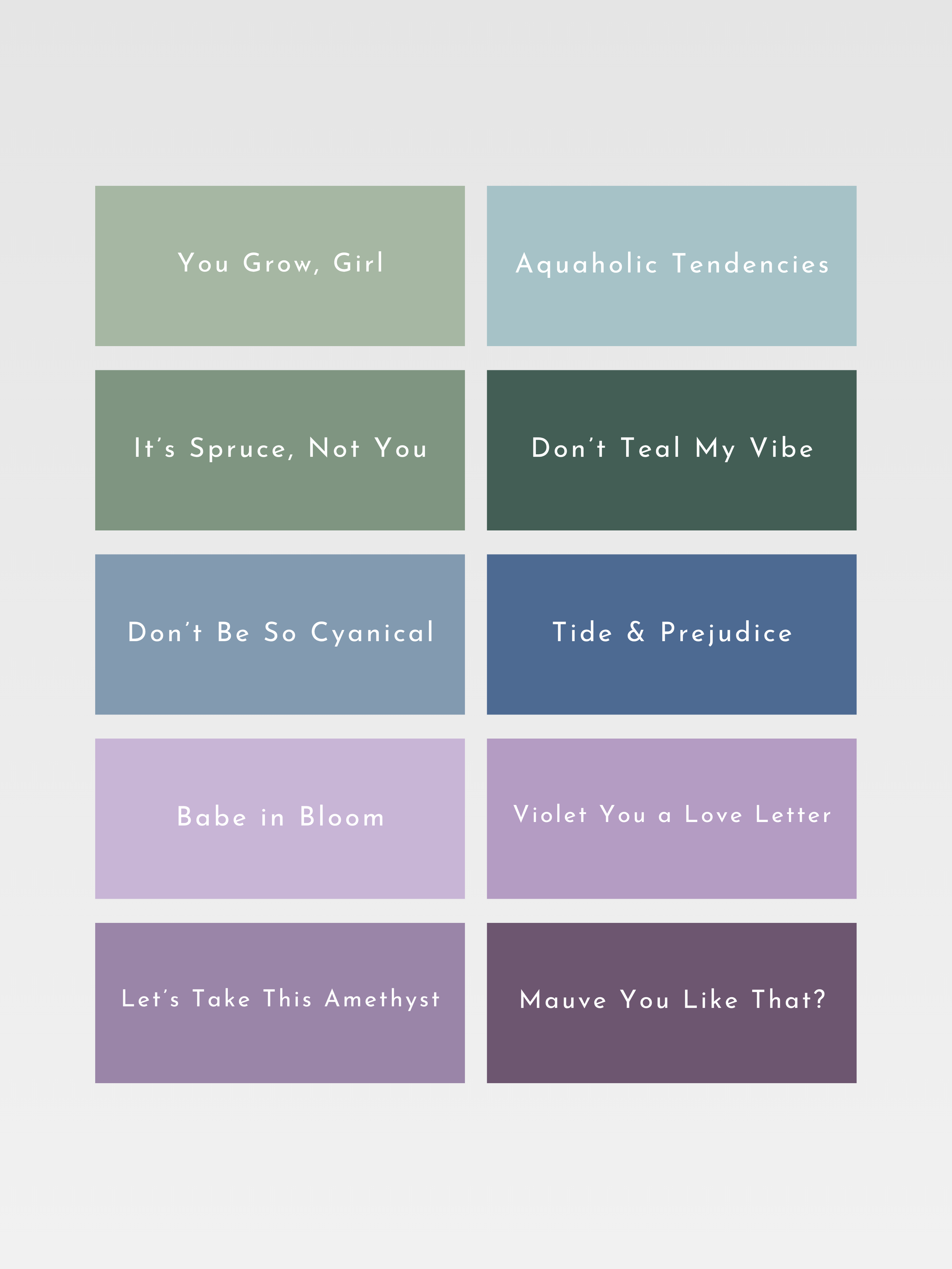
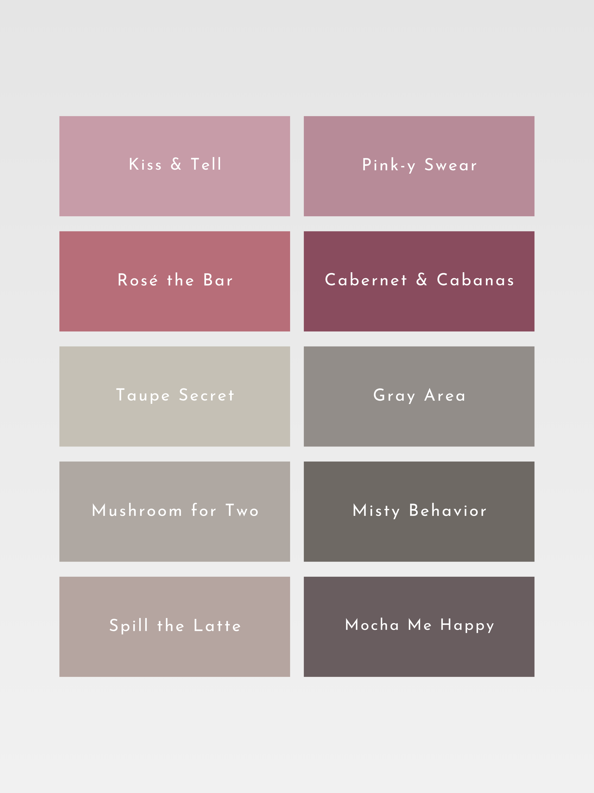
Muted, cool-neutral and hazy.
COOL SUMMER
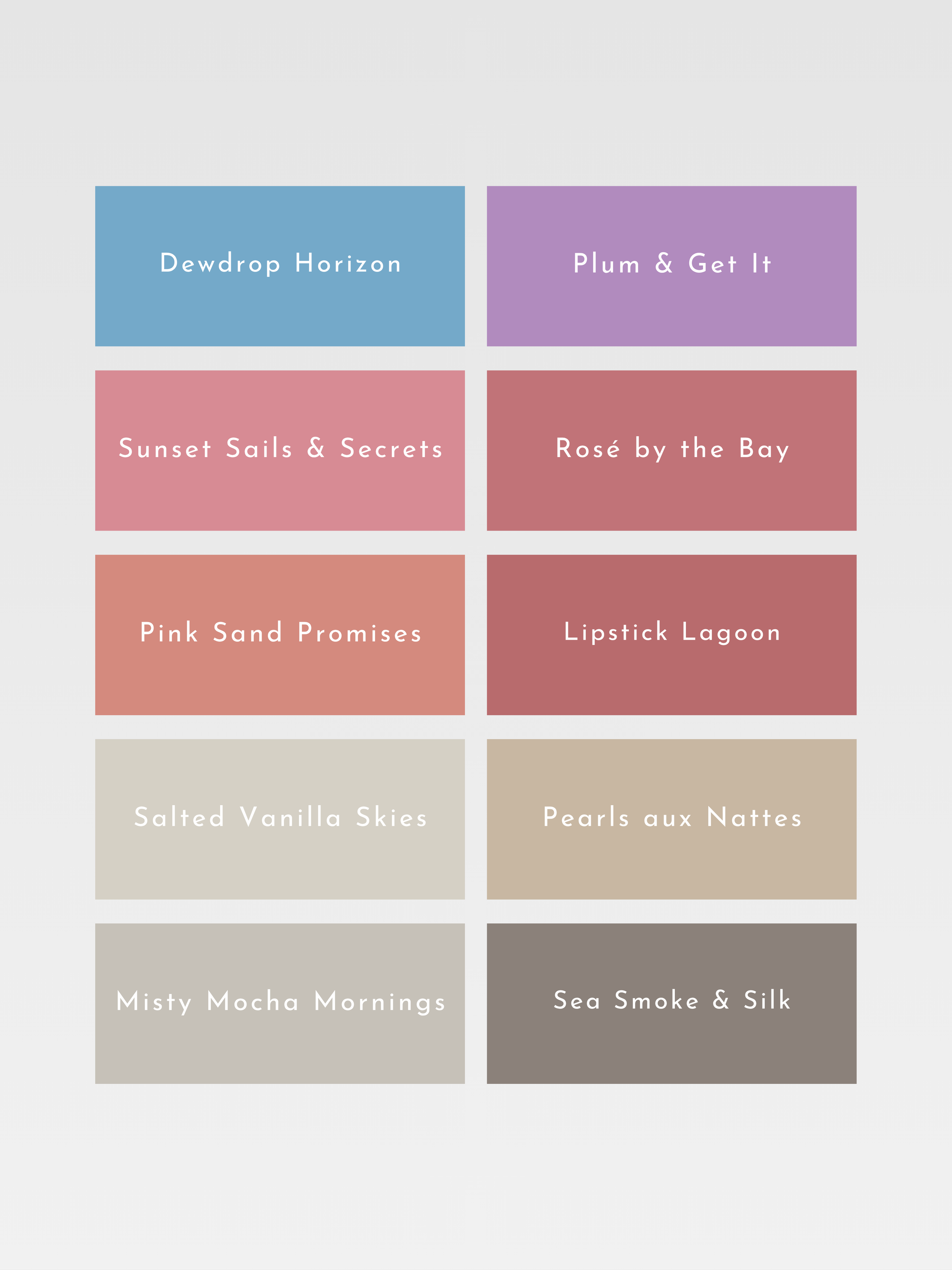
Cool Summer is a distinctly cool palette of rose, raspberry, blue-gray, lavender and ocean blue. Its colors are calm and balanced, with a graceful depth and a naturally cool quality that gives the palette its composed character.
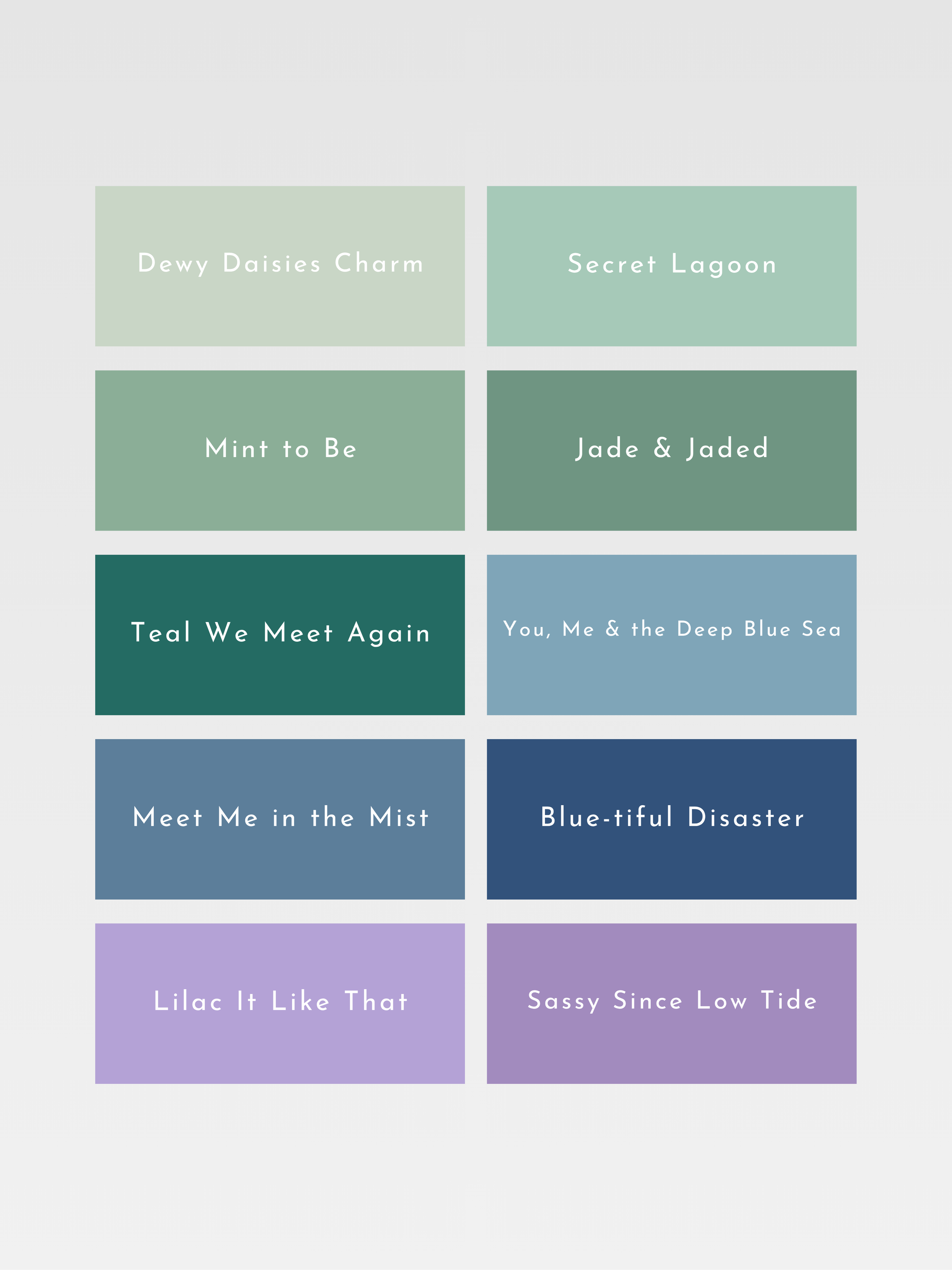
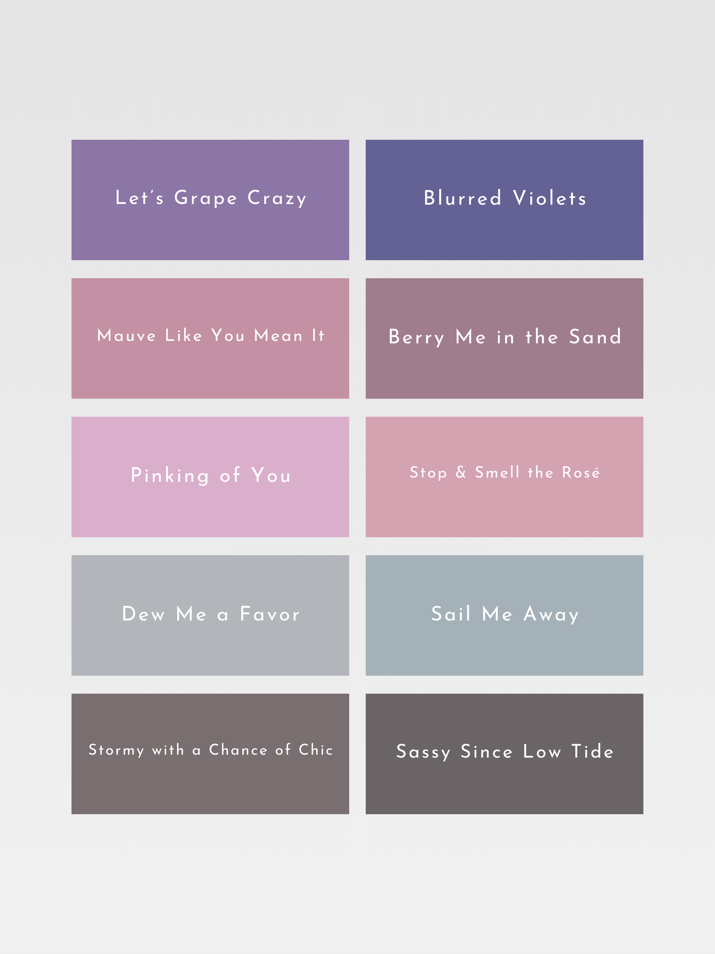
Cool, muted and serene.
LIGHT SUMMER
Light Summer is a palette of airy, luminous color: powder blue, pale rose, lavender, seafoam and soft aqua. Its shades are cool and gently muted, with an almost weightless quality reminiscent of color seen through soft summer light.
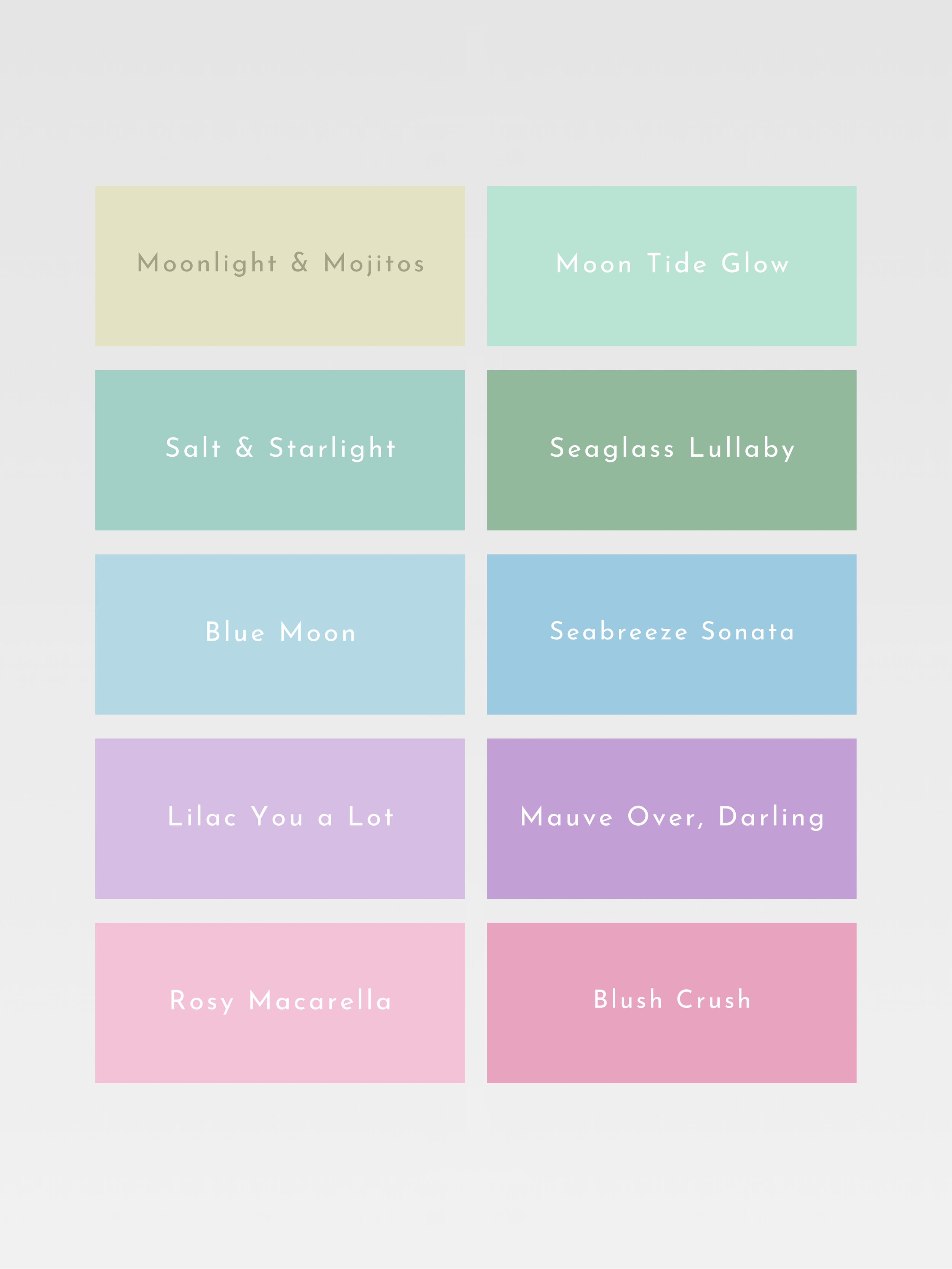
Light, cool-neutral and delicate.
LIGHT SPRING
Light Spring is a palette of delicate warmth and luminous color: peach, warm pink, light aqua, fresh green and creamy yellow. Its shades are clear and airy, carrying the brightness of spring without becoming strong or saturated.
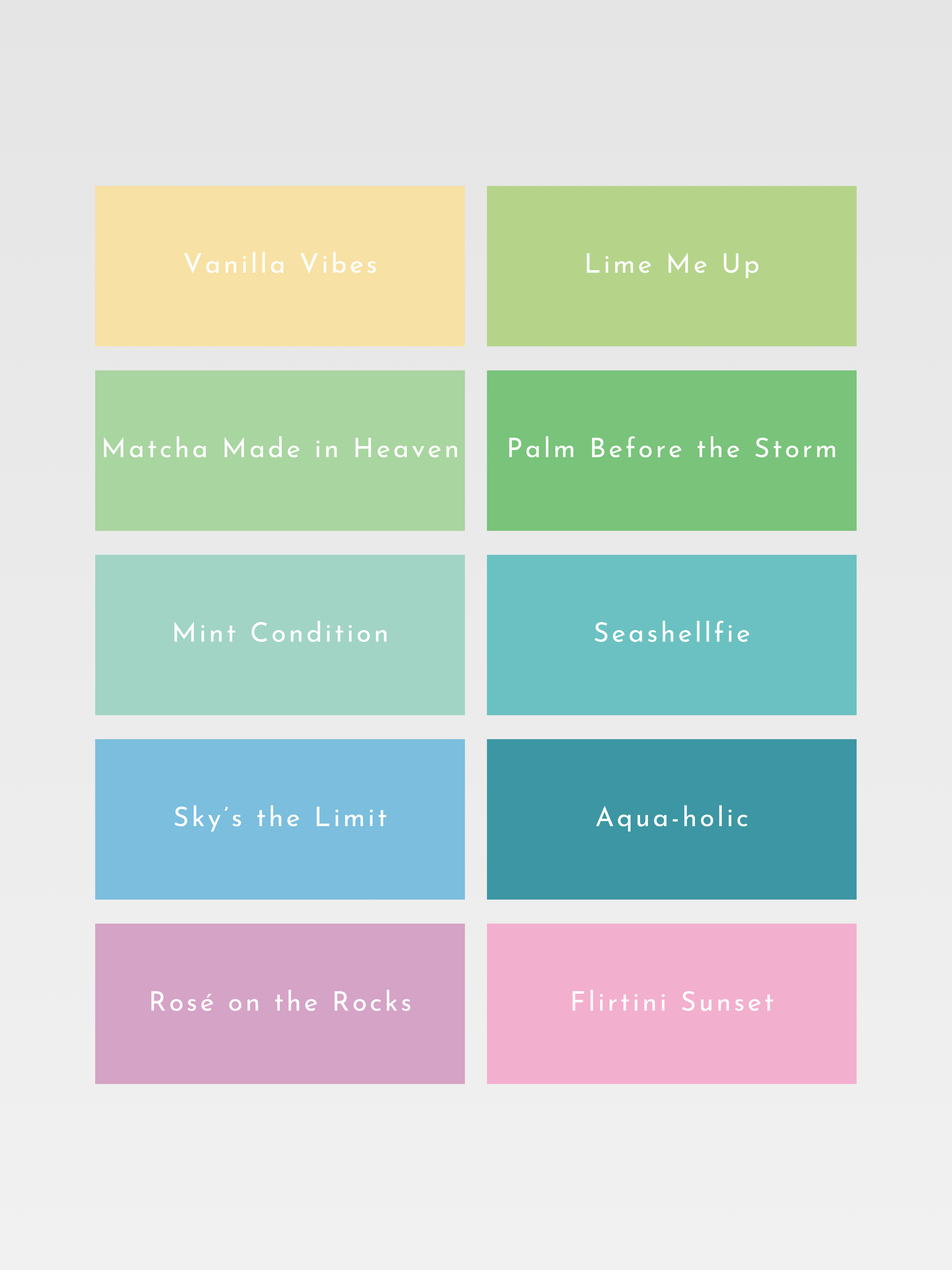
Light, warm-neutral and fresh.
WARM SPRING
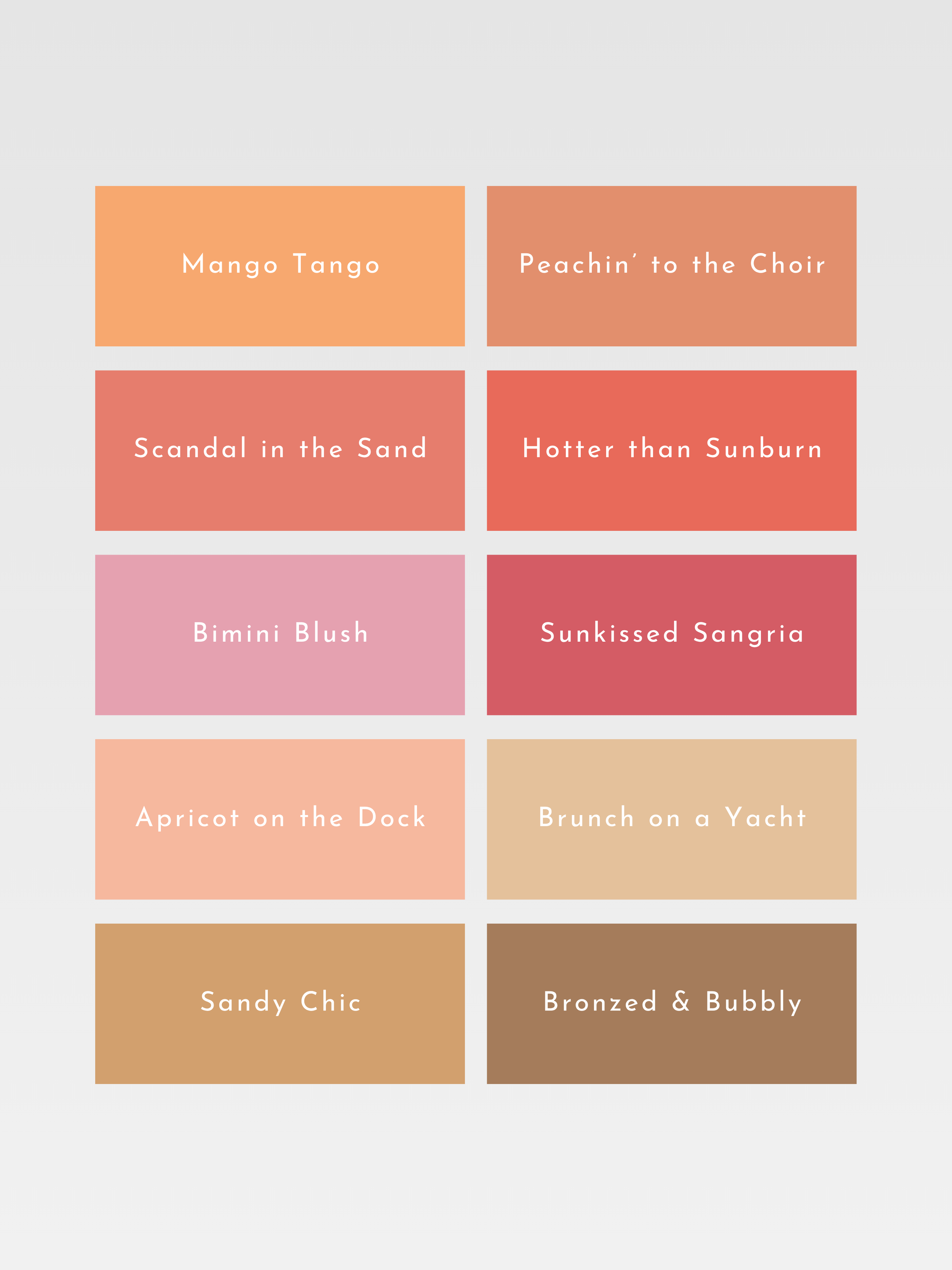
Warm Spring is a palette of unmistakable golden warmth: coral, apricot, leaf green, turquoise and warm ivory. Its colors are lively and glowing, with a fresh richness that always feels touched by sunlight.
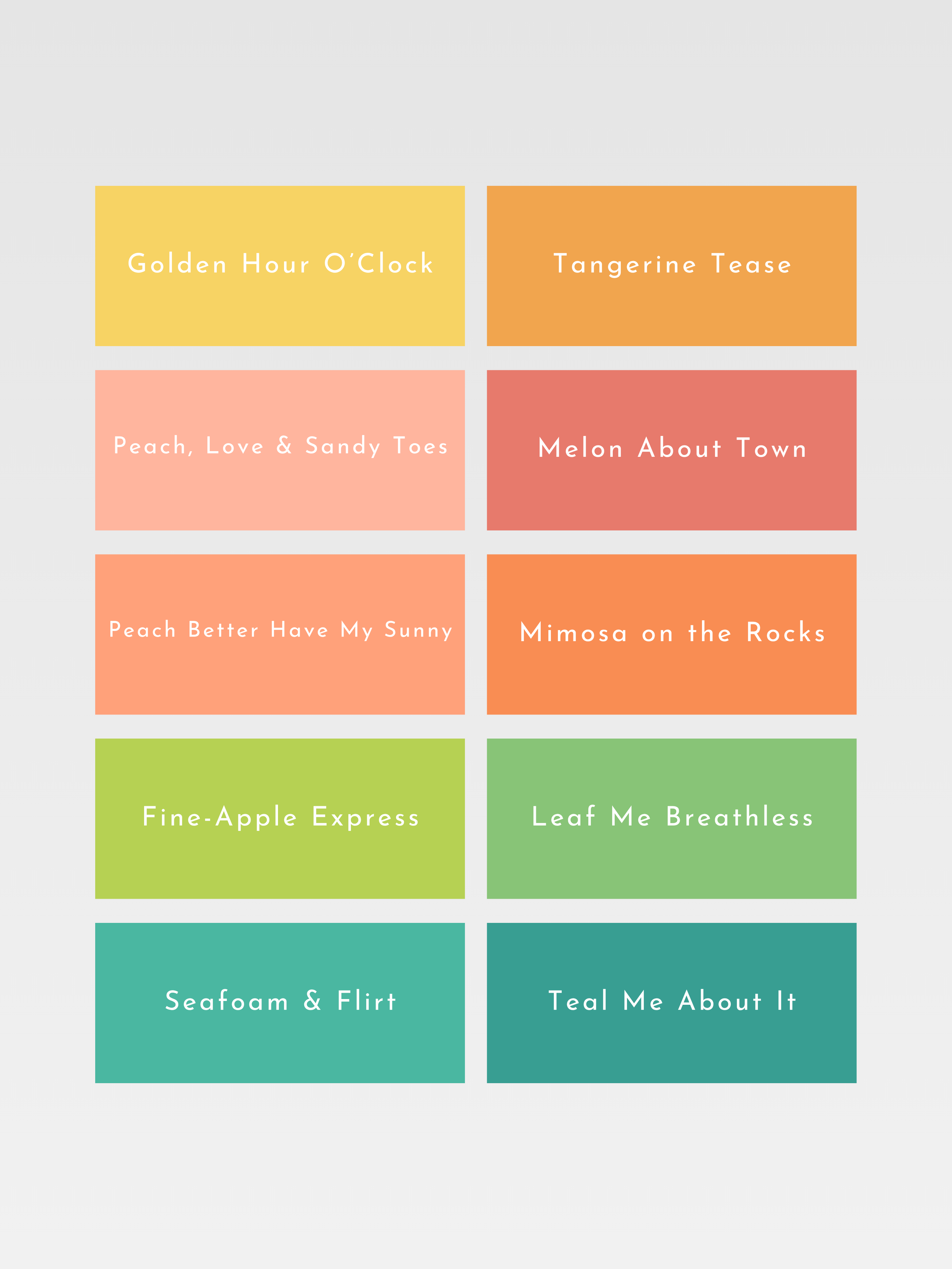
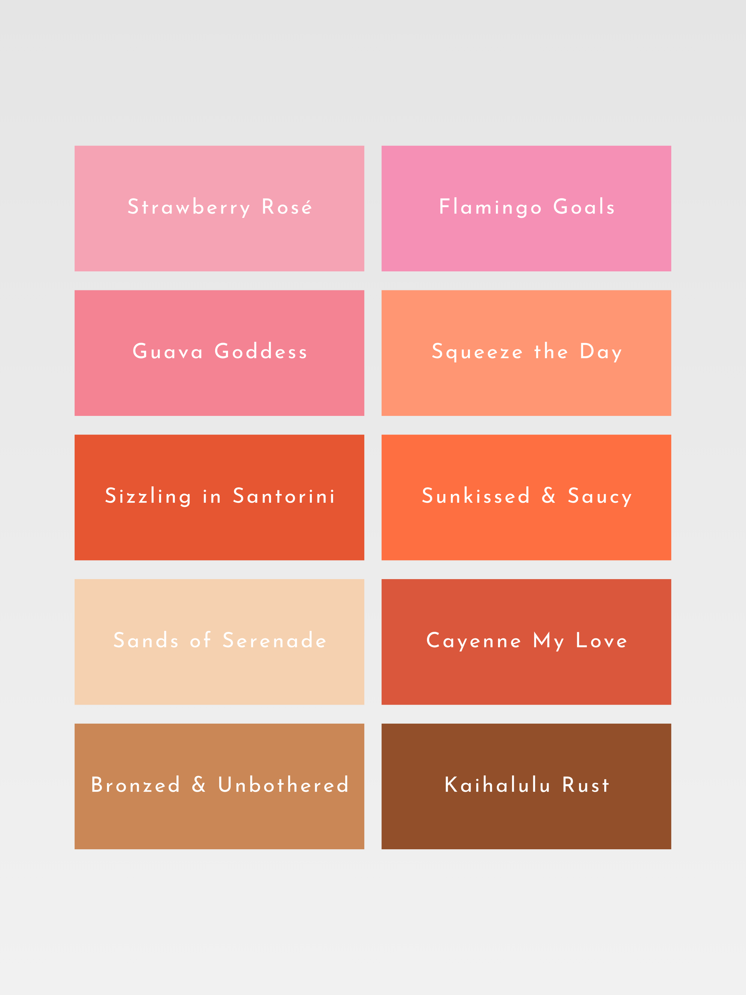
Warm, clear and sunlit
BRIGHT SPRING
Bright Spring is a palette of vivid, crystalline color: brilliant coral, turquoise, fresh lime, warm cobalt and clear pink. High in clarity and energy, its shades are striking and saturated while retaining the warmth and lightness of spring.
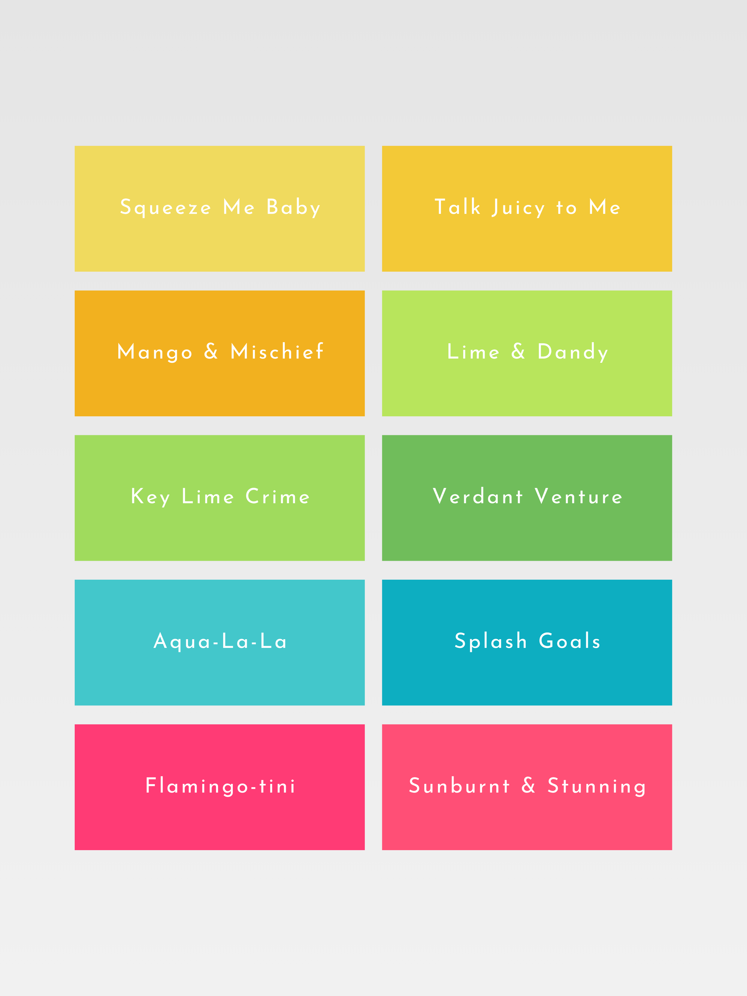
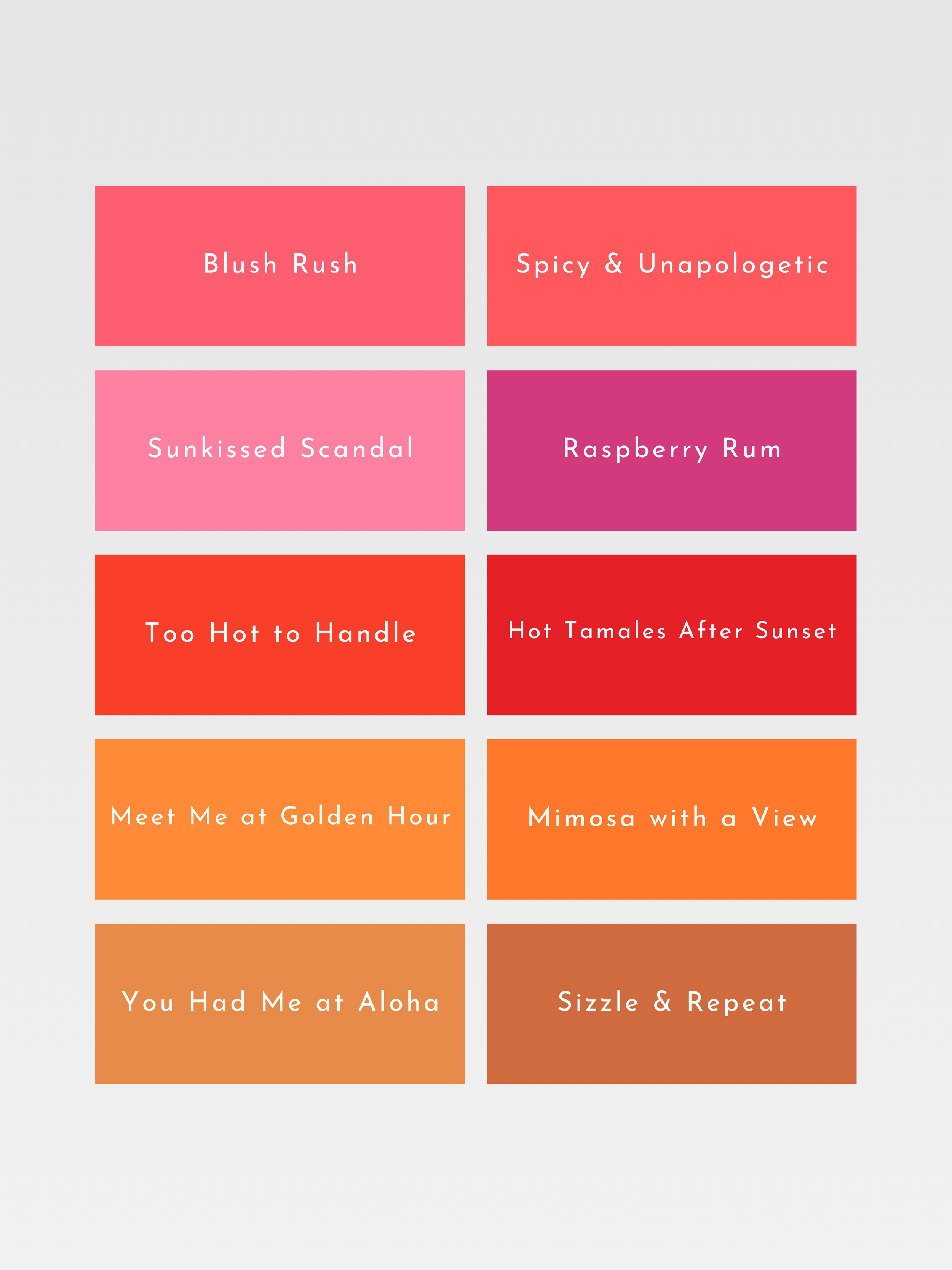
Bright, warm-neutral and vibrant.
BRIGHT WINTER
Bright Winter is a palette of brilliant, electric color: vivid fuchsia, cobalt, icy turquoise, emerald and true red. Its shades are exceptionally clear and saturated, brought to life by the sharp contrast and luminous intensity that define this season.
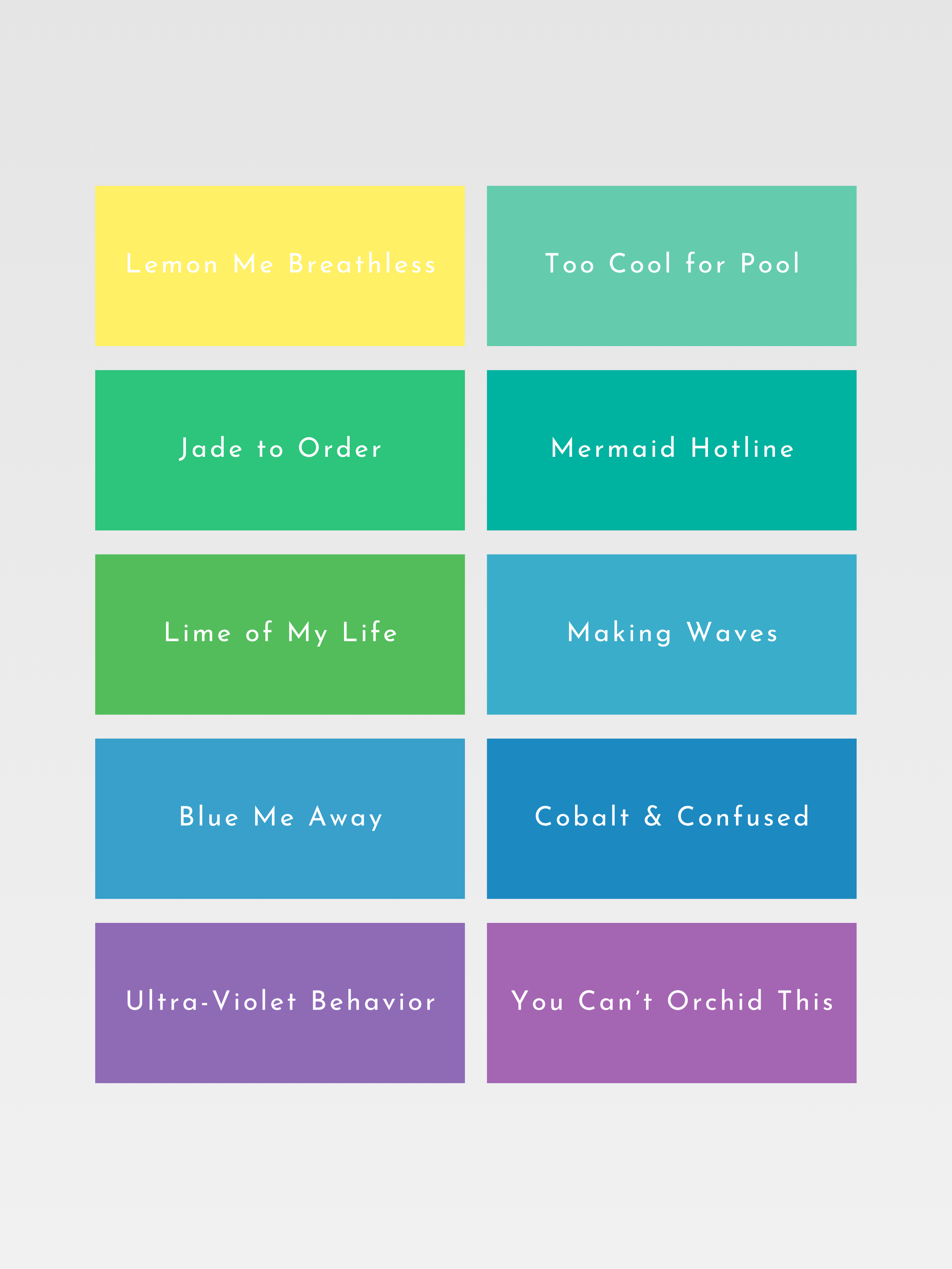
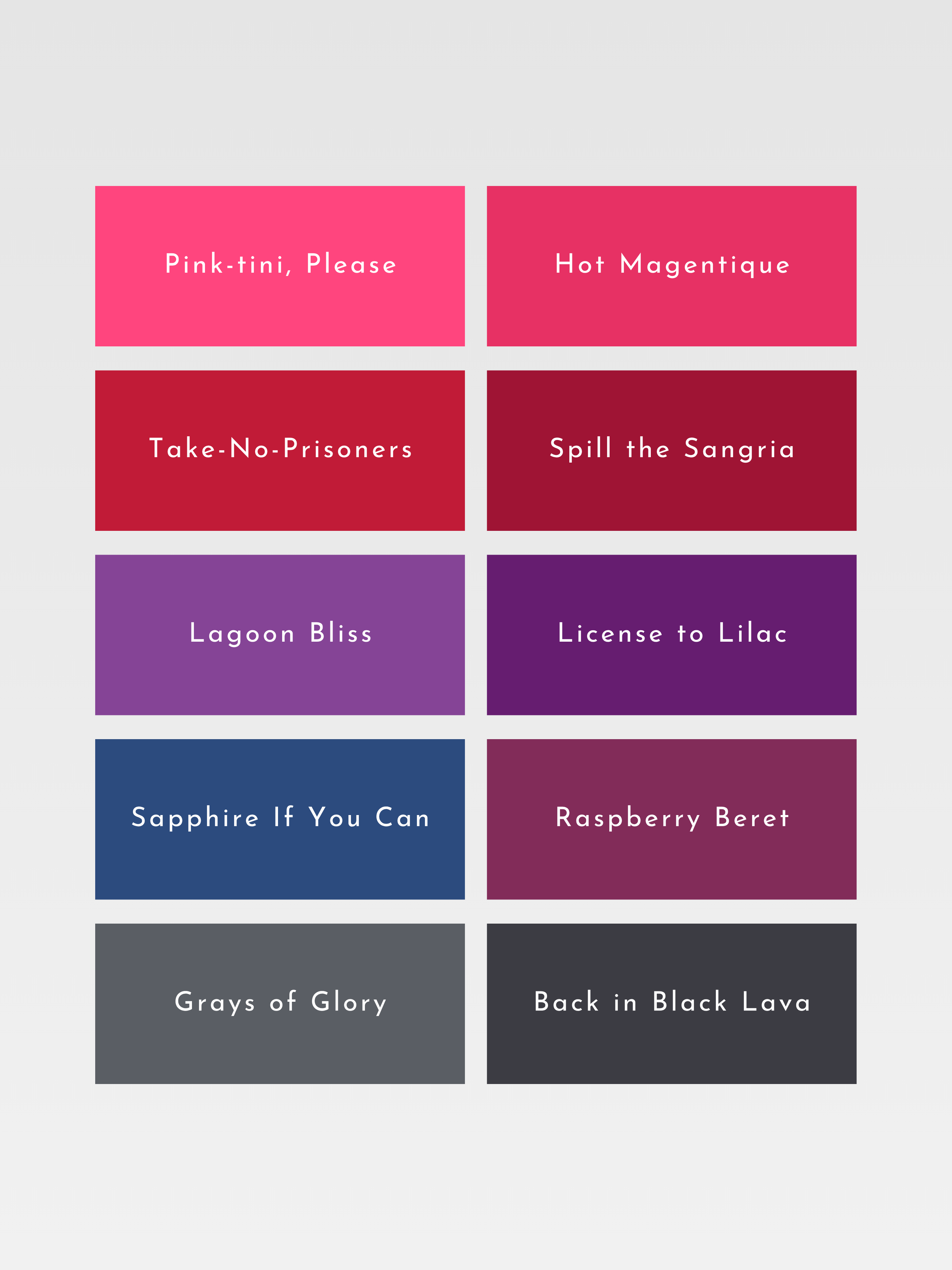
Bright, cool-neutral and high-contrast.
COOL WINTER
Cool Winter is an unmistakably cool palette of icy pink, sapphire, cool red, emerald and crisp navy. Free from warmth and softness, its colors are precise and saturated, with the striking clarity and contrast characteristic of winter.
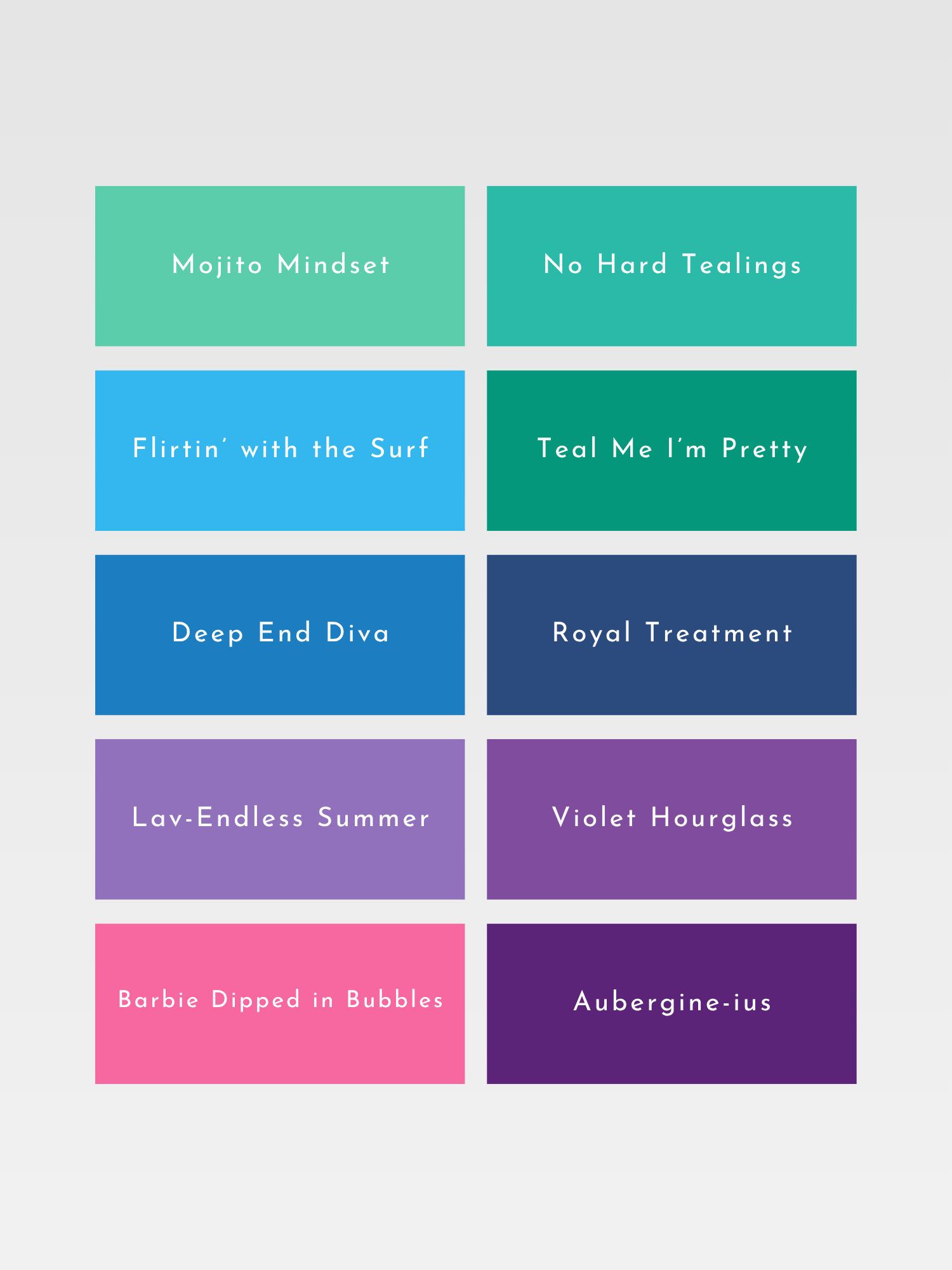
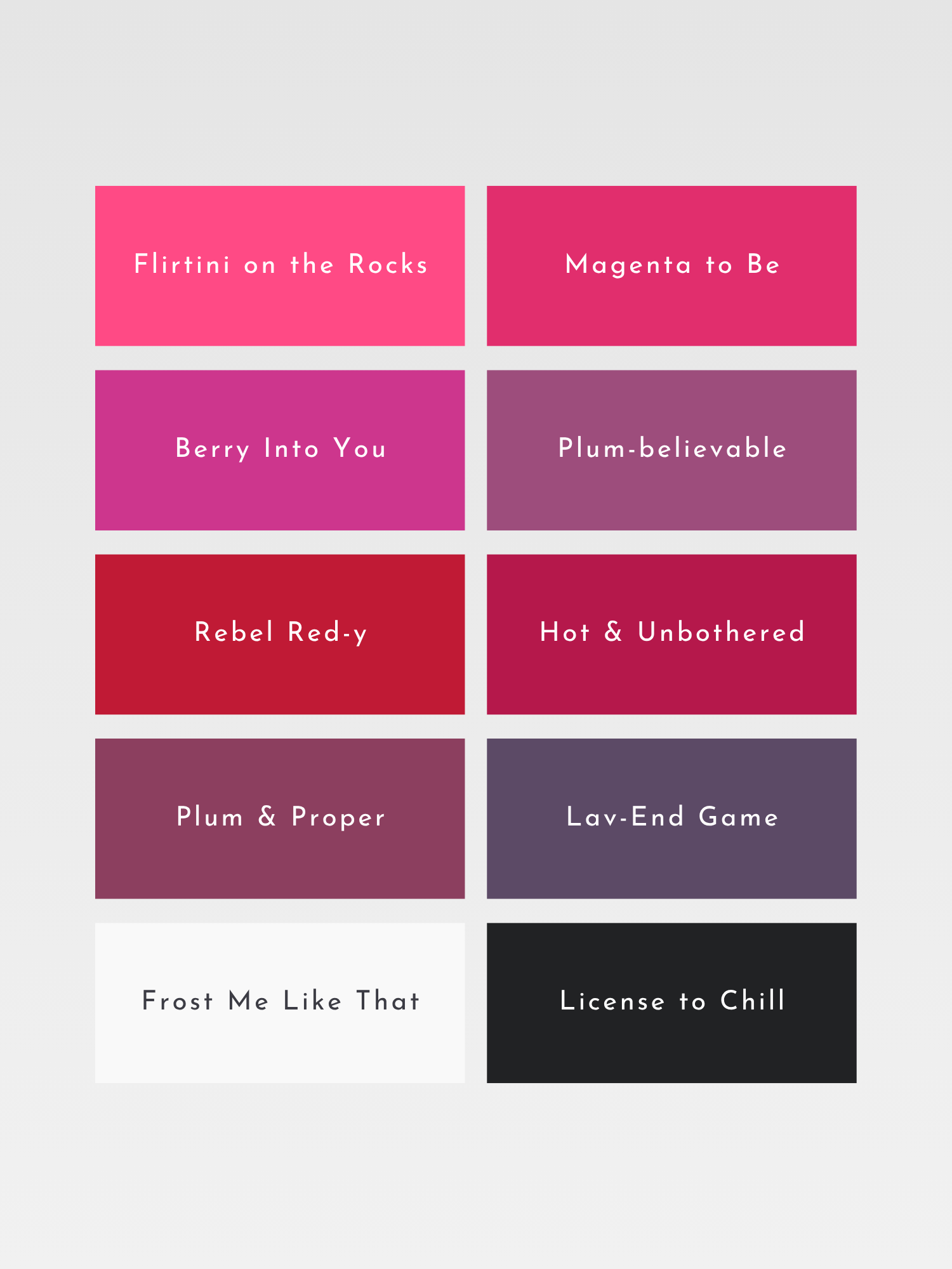
Cool, crisp and intense.
DEEP WINTER
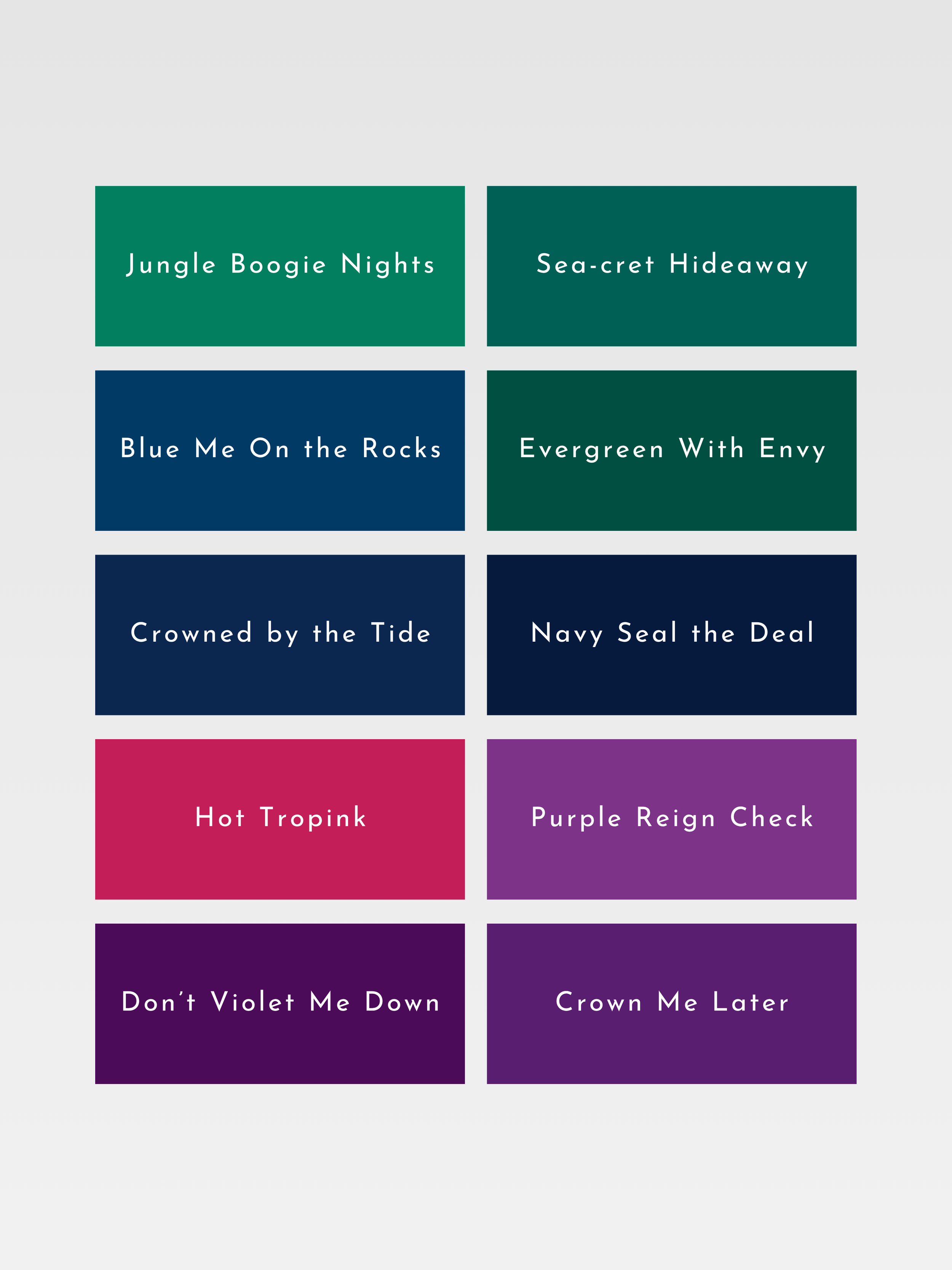
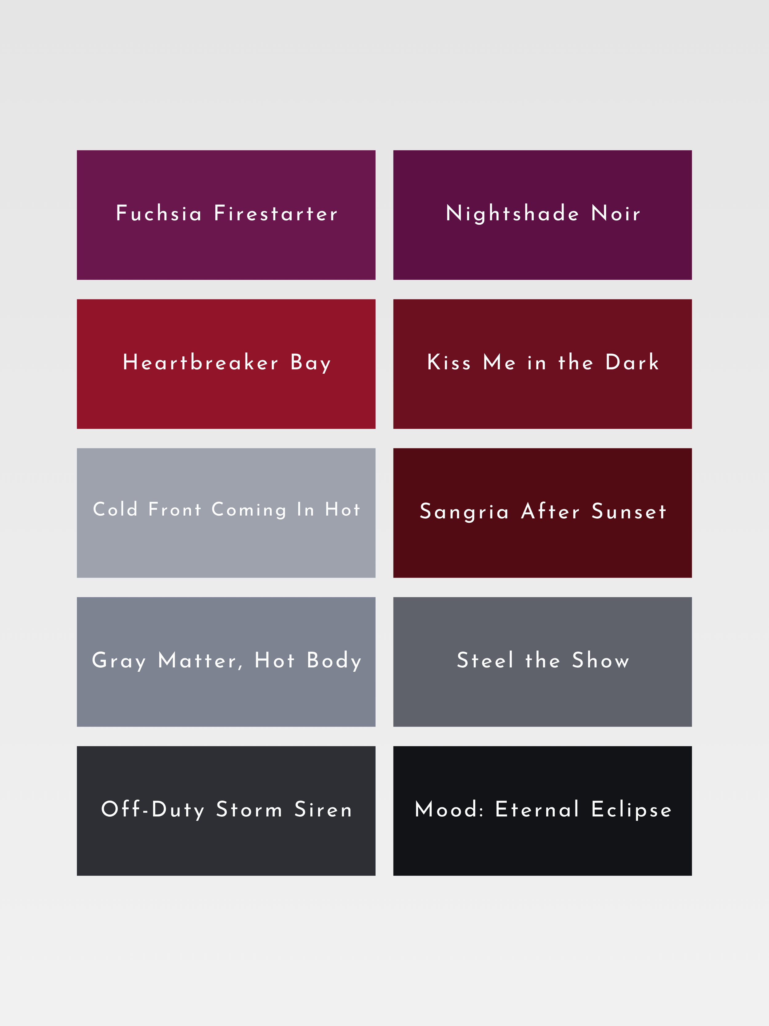
Deep Winter is a palette of dark, powerful color: black cherry, midnight blue, deep emerald, burgundy and charcoal. Its defining depth is sharpened by winter contrast, creating shades that feel intense, sophisticated and commanding.